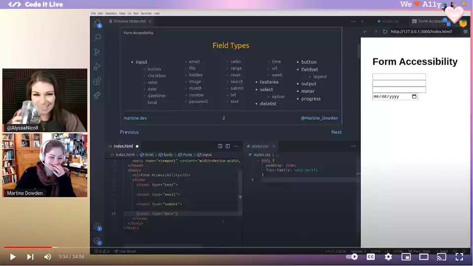
Although part of most applications (because let’s not kid ourselves the vast majority of applications are CRUD apps) a well designed accessible form is still one of those things that is really hard to achieve. There are so many factors to remember: labels, keyboard accessibility, validation, content organization, etc… Although as developers we create them often, it is easy to overlook or forget a piece.
In this session we will cover
- Making sure our fields are appropriately labeled
- Handling check marks and radio buttons
- The value of hints to guide our users
- Keyboard accessibility
- Validation
- Some testing options