User Experience
Every project begins with the User Experience. I use various methods including interviews, observation, surveys, metrics, and testing to develop strategies that will align user goals with client requirements.

Design Process
Web and Interaction Design

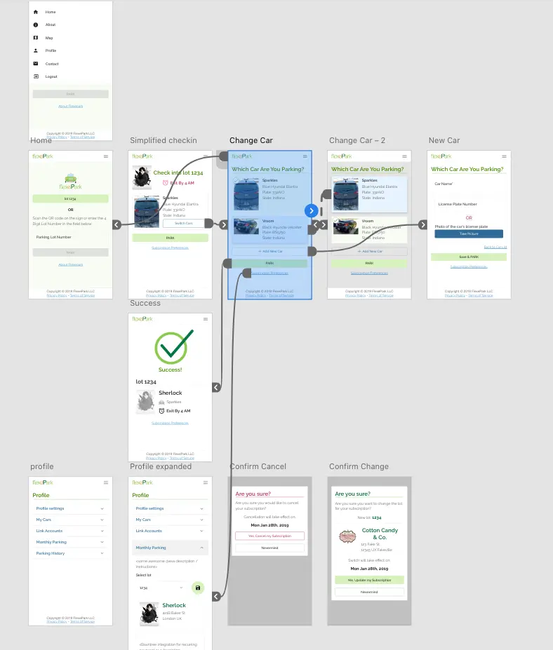
To best flesh out visual and interaction design, we use wireframes and interactive mockups. These allow for:
- a clear understanding of the end product
- user testing
- stakeholder review
Visual Design
Programming Languages ABC++
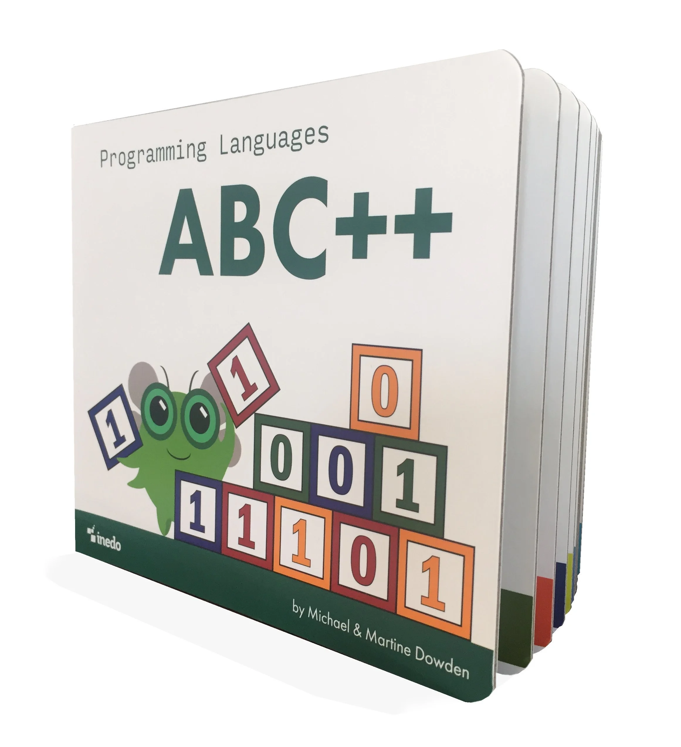
Programming Languages ABC++ is an alphabet book all about coding that’s fun for both toddlers and their grown up counterparts.

While working on this project we started with character concepts. Once a character was established we iterated through illustration concepts for each page. Each page included a letter, a “Hello World” program in the language starting with the letter, and some facts about the language.
Each illustration included a tech concept starting with the letter. For this project we created an illustrative concept for each page including the tech association to be referenced in the image.
Success Story
FlexePark is a parking management solution which turns existing, unused pavement into parking spaces using a simple, web-based mobile platform. Drivers can locate, check-in, and pay for parking using their phones without downloading and installing a mobile app. The FlexePark shared parking model improves land use with user-friendly technology and helps property owners generate extra cash with minimal effort.
Profile Page
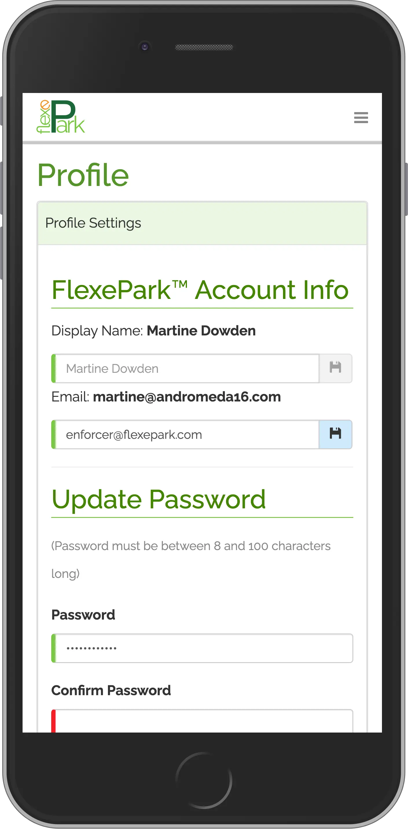
The original design for the user profile was a single page, with all user actions contained in a single location. An accordion was used to differentiate between sections.
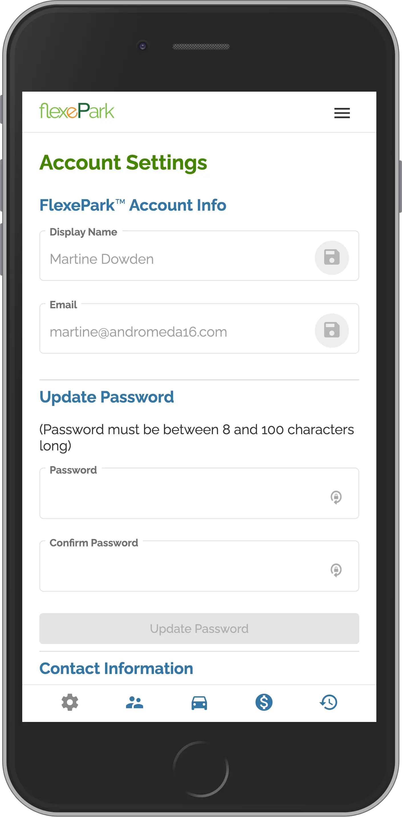
However, as the application grew and more and more users were needing to access their profile, the support of this page kept increasing. We both needed something easier for the users to understand and also provide additional self-management tools.
Check-In Process
This patented process was designed with a total focus on the user experience and perspective. The result was a number of first-in-class features (for parking apps) that made it easier for customers to pay and park, including:
The result has been a 90% conversion rate during the first three years of operation.
- Initiating the process by scanning a QR code or NFC tag (zero typing required)
- Registering a vehicle with a photo (instead of needing to type vehicle information)
- Social login (instead of having to use email/password or provide some email verification)
- Scanning credit card information with camera (instead of typing, on supported devices).
